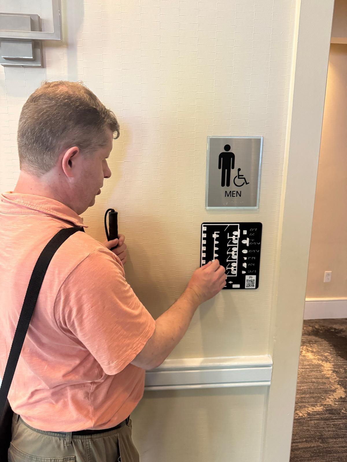
A tactile map is a map designed to be read by touch: spatial relationships translated into a form the fingertips can read. Raised lines, textures, shapes, and braille labels do the work that printed lines and colors do on a visual map.
The variety is the point, which is why the definition has to rest on the principle rather than the format. Tactile maps range from a flat embossed sheet showing a single room to a 3D-printed mountain range the size of a tabletop. They are made of paper, plastic, or 3D printed models; some have braille, others have shape and texture alone. No list of formats stays complete for long, because anything spatial — a building, a trail network, a country, a museum gallery — can become a tactile map once its layout is designed for touch.
A sighted visitor entering an unfamiliar building does something no one has to teach them. They look around, and within seconds the directory board, the signage, and the "you are here" map give them a working picture of the space — where the entrance was, which hallway leads where, how to get back out. Blind visitors need that same picture. A tactile map is what provides it.
How tactile maps are read
Reading a tactile map is a matter of tracing. The fingertips follow raised lines marking walls, paths, and borders, while distinct textures represent different surfaces — a rougher patch for grass, a smooth one for pavement, wavy lines for water. Braille labels identify the rooms, streets, and landmarks. A tactile key explains the symbols, serving the same function as the legend on a visual map: the reader learns the handful of symbols first, then reads the map.
Most blind people learn this through orientation and mobility training. The first map takes some getting used to, but it gets better with practice. Probably the reason why it takes much longer for blind kids to learn to read tactile maps is because they have much less access to maps than sighted kids, and the opportunity to practice and learn is less.
Benefits of tactile maps
Spatial awareness. Sighted visitors build a mental picture of a space continuously and unconsciously, while blind visitors build theirs deliberately — and a tactile map is among the fastest ways to do it. Feeling a layout before moving through it, the entrance here, the hallway there, the destination in the far corner, transforms the experience of arriving somewhere new. That picture is the foundation from which everything else follows.
Independent navigation. From the picture comes the ability to plan a route instead of discovering it by walking into it. With the layout under their fingers, visitors can find the platform, the gallery, or the exit on their own terms, without waiting on staff or asking strangers. The significance is easy to underestimate: many blind visitors will skip a venue entirely rather than ask for help.
Public spaces. The applications span every public environment, and museums are the natural home: a gallery map at the entrance conveying the shape of an exhibition — its rooms, its highlights, the way to navigate between them.
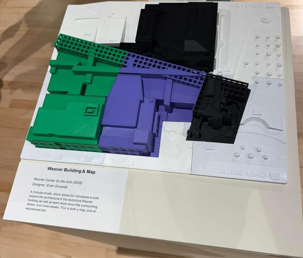
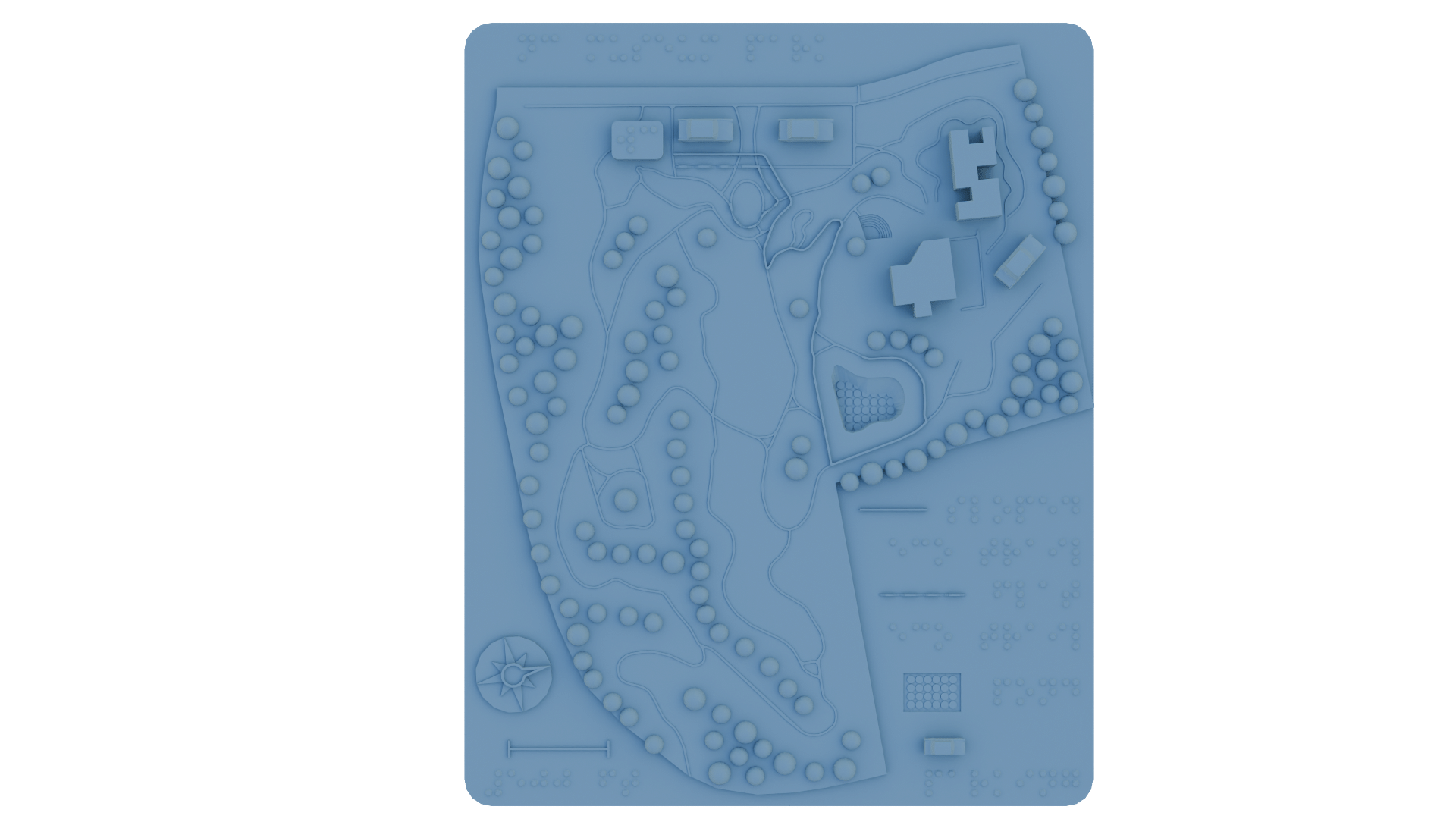
Transit stations need platform layouts, ticket counters, exits, and the paths connecting them; parks and visitor centers need trail maps with restroom and picnic area locations; public buildings need floor plans at the entrance and evacuation maps at stairways. In an emergency, a blind person needs to know where the exits are before anything happens, not after.
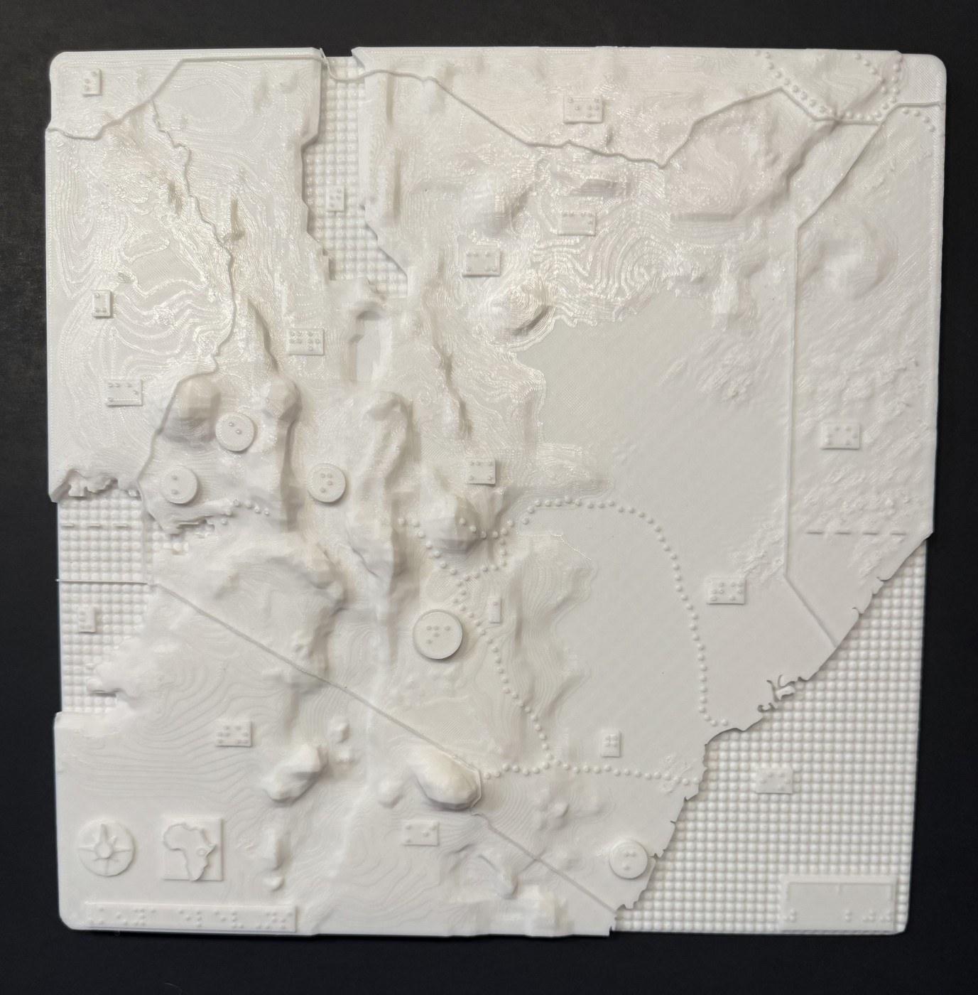
Education. Schools use them as teaching tools. I have produced elevation maps with braille labels for classroom use, including a map of Kenya's terrain that students explore by touch, learning geography the way sighted students learn it from a wall map.
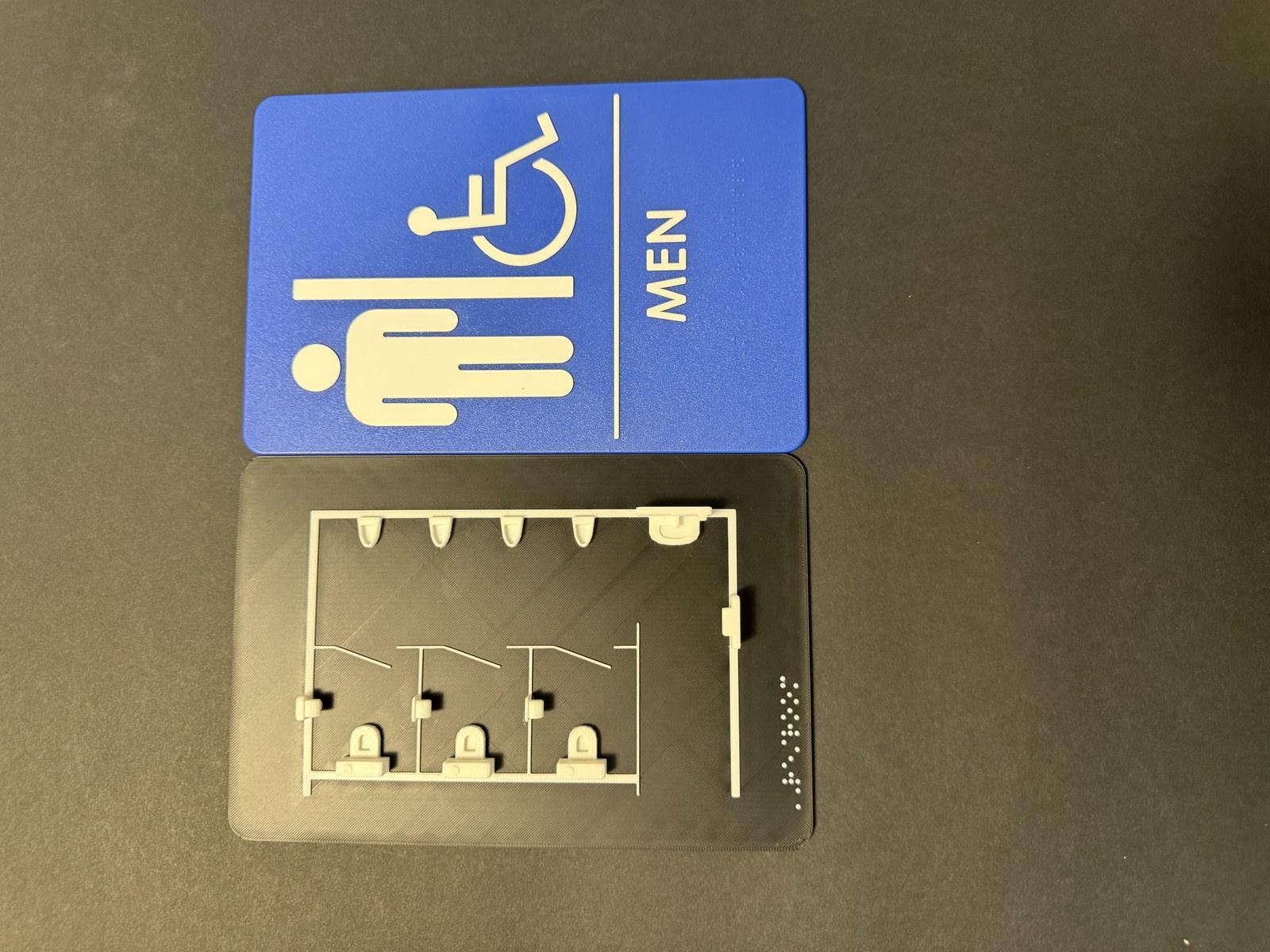
And the smaller, practical end: restrooms. Even Grounds makes a 3D-printed restroom map, a miniature replica of the layout mounted beside the ADA sign, so that a blind visitor can locate the sink and stalls by touch before entering.
Types of tactile maps: 2D and 3D
Not all tactile maps are made the same way. There are two types, and they are different approaches to the same problem.
2D tactile maps are produced on flat sheets: a braille embosser or thermoform machine raises lines, dots, and textures on paper or plastic. They are inexpensive, lightweight, and quick to produce, and they handle straightforward layouts — a floor plan, a street grid, a park trail — very well. Their constraint is the number of symbols. A 2D tactile map should not carry more than five to seven types of marks; beyond that, the reader faces a learning curve that defeats the purpose. Too many textures stop being informative and start being noise.
3D tactile maps are printed as physical miniatures of the place itself: stairs become small steps, a mountain becomes a scaled-down mountain, a building becomes a little building. Because the shapes resemble what they feel like in the real environment, the learning curve diminishes significantly.
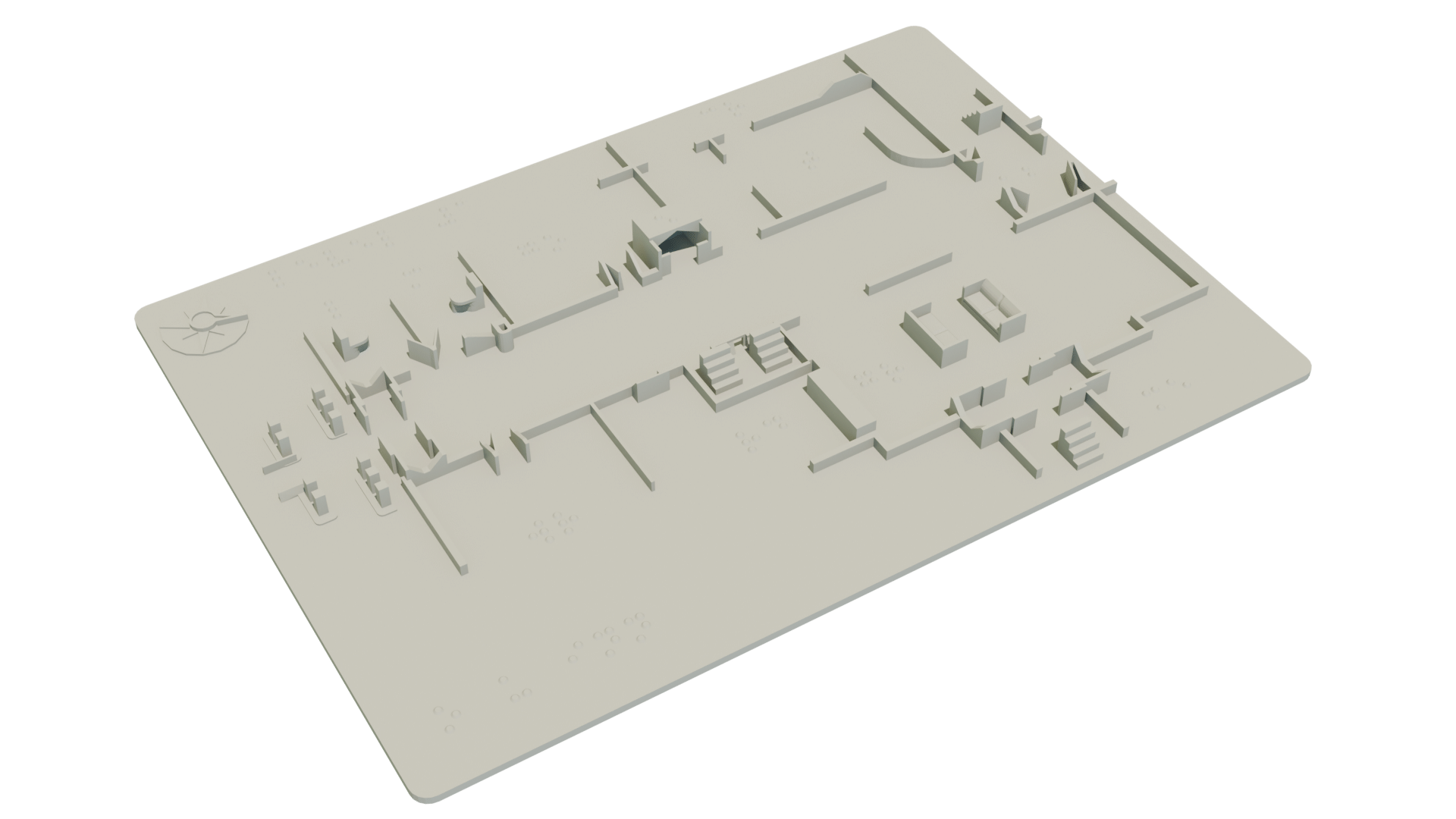
For example, a small staircase is almost self-explanatory in the key. That makes 3D the right choice wherever shape carries the meaning: elevation maps, where the exact form of the terrain matters, or complex floor plans and parks, where the list of features would overwhelm a flat sheet.
The trade-off is time and cost. A single print can run five to ten hours, and the materials cost more than a sheet of plastic. So the decision comes down to what is being represented. When we made two Ohio maps, one showing elevations and one showing cities, the elevations map needed 3D and the cities map did not — a cities map is two-dimensional information, and a flat graphic serves it well. I have written in detail about when 3D printing is preferable to 2D tactile graphics.
Braille on tactile maps
Every tactile map discussion eventually reaches braille, so it is worth addressing directly: braille labels are essential — they name things — but they are not the map. A map with braille labels and no tactile graphics is a list, while a map with tactile graphics and no braille is a puzzle with no answers. Both are required, and the braille has to be executed properly — correct size, placed where fingers naturally fall, never squeezed into corners as an afterthought. When printing 2D maps generally standard braille is used, but on 3D printed maps it is not done automatically, the designer needs to ensure that the right braille dots and letters are used.
Balancing label density against readability is a design discipline of its own, which I have written about separately.
Challenges in tactile map design
Three problems come up on every project.
Complexity. As noted above, a tactile map cannot carry nearly the detail of a visual map. Every symbol must earn its place, symbols must remain consistent across the map, and the key must be findable by touch, because a key placed where fingers never go is decoration. 3D sidesteps some of this, since recognizable shapes need less explaining, but the discipline is the same: show what matters, leave out the rest.
Durability. These maps are touched hundreds of times. Paper wears out, while plastic and 3D prints endure. A map that cannot survive its audience is not a finished product. Thus, I generally recommend that if you use paper maps, have a few extra ones available when needed. 3D maps on the other hand when get used for months and years should be cleaned.
Placement. The map must be mounted where people can actually reach it. A tactile map behind glass, or hung too high to touch, is a failure of implementation. I have encountered both. Generally when a map is a handheld size, it is recommended not to mount it but to hand it to the user who can read it where it is most comfortable.
What tactile maps cannot do
A tactile map will not teach anyone to travel a route on its own; it is one instrument among several, alongside orientation and mobility training, staff assistance, and a phone's GPS. It provides the picture, and the visitor still has to walk the buildings or the streets.
A map is also only as current as its last revision. Buildings change, a renovation relocates a staircase, an exhibition is rehung — and a map that no longer matches the space actively misleads. Organizations that install tactile maps should treat maintenance as part of the commitment, not an optional extra.
Conclusion
Every venue with a "you are here" map for sighted visitors has made a statement about who is entitled to orient themselves independently. A tactile map beside it extends that statement to everyone. It is not decoration and it is not charity. It is the difference between entering with a picture of the place and entering hoping for the best.
If your museum, conference, or public building needs tactile maps designed, read about our accessible 3D design services, and get in touch.